HDTV displays: How good do they need to be?
The professional video industry's #1 source for news, trends and product and tech information. Sign up below.
You are now subscribed
Your newsletter sign-up was successful
Just as color TV technology did some 50 years ago, digital HDTV is finally beginning to enter American homes. Unfortunately, for a time, the limited amount of programming and high cost of the HD sets created a roadblock to widespread and rapid adoption. The situation is changing now as a result of the FCC mandate requiring TV broadcast receivers to include DTV reception capability in large-screen receivers beginning this year, and for all TV reception equipment starting July 2007. Combined with these factors are exciting new display technologies and lower set prices, which have helped to finally launch HD as the standard by which viewers will describe their video experience.
The question for display quality then becomes: “How good is good enough?” Broadcast professionals are expected to be the experts on this question. And the image quality viewers expect to see on their own TV sets will affect the equipment, programming and even creative decisions made in stations and production houses.
As price and technical capability merge, what should consumers expect from the new display technology, and how should performance be evaluated? This discussion covers high-quality display technology for home entertainment, information and education applications. First, keep in mind that the images television provides are primarily moving. Still shots are shown only for short periods.
Article continues belowSecond, the viewer has little control over those images. The program director, producer and editors decide what is seen. Viewers don’t walk closer to the TV screen in order to see details. If the producer decides that the viewer needs details, he provides a close-up. This means that the viewer has little choice in where his attention is directed. At best, all he can do is move his attention from one area of the screen to another.

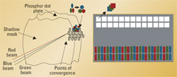
Figure 1. Comparison between analog CRT (left) and today’s digital displays (right). The 3-level flat or projected displays afford vastly improved resolution, in part because of the closer spacing between picture elements — pixels. Click here to see an enlarged diagram.
Crucial to this discussion is that displays talk to viewers through the eyes. It is therefore useless to display anything on the screen that a viewer’s eyes cannot perceive. Finally, whatever information is presented on the screen should not strain the eyes. The goal is for the viewer to be relaxed and enjoy the entertainment and performances. All this means is that the quality of the display should approximately equal the needs and capability of the human eye.
Display technology
The professional video industry's #1 source for news, trends and product and tech information. Sign up below.
Let’s first look back at old-style video display screens. Perhaps the biggest problem with older (and most current) displays is that they don’t have enough scan lines. While 625 lines (PAL) or 525 lines (NTSC) are the standards, useful display area is limited to about 500 lines for PAL and 400 lines for NTSC. An obvious major disadvantage of these old systems is that the line structure is too visible. One solution often used on high-end home theater projector displays is line doubling. While not HD quality, it’s a step in the right direction. And, in fact, that’s just what the new HD standards do, double the vertical resolution.
A major change, common to all new displays, is that images are no longer scanned line-by-line. The new displays address the screen as a matrix of rows and columns, much like random address memories. Screens are in fact RAMs. For short periods, the desired brightness values are stored in memory cells called pixels. Thus, screens don’t have lines any more, only rows or columns of pixels. Each pixel is composed of 3-color sub-pixels. (See Figure 1.)
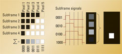
While conventional analog CRTs rely on the electron beam scanning the screen surface, where it is amplitude (or intensity) modulated, new displays use different methods of presenting the digital data. These methods vary from pulse width modulation (PWM) to displaying the binary digits directly. (See Figure 2.)

Figure 2. Digital displays typically rely on an 8-bit architecture. This produces 256 levels of gray or more than 16 million colors. A 4-bit example is shown above. Click here to see an enlarged diagram.
In an 8-bit digital system, each pixel has to be addressed eight times (once for each bit) to define the brightness of each pixel on the screen. This means that each video frame becomes eight subframes. In case of the PWM, the first subframe carries the least significant bit value (0 or 1) of each pixel with the shortest exposure time. The next bit (0 or 1) is written during the second subframe and exposed longer.
All of this would be worthless were it not for the eye’s ability to “store” information. Areas at the back of the eye are covered with what are called “cones.” They are photosensors with the ability to remember. Thus, it’s possible to have a pixel change values rapidly and these subframes add within the eye to provide the correct brightness value for each pixel. The value of each bit (0 or 1) is transmitted sequentially, relying on the memory of cones in the eye to combine the pulses into a single image.
An 8-bit digital system can display up to 256 levels of gray, which is more than the eye can perceive. Considering that display systems rely on three 8-bit colors, combining them in all possible ways creates the familiar palette of 16 million-plus colors often mentioned in display panel advertisements.

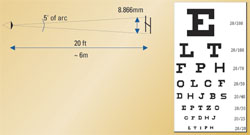
Figure 3. Snellen eye chart. A person with 20/20 vision should be able to see an image with a height of five minutes of arc at 20 feet. Click here to see an enlarged diagram.
So how good should a TV display be?
The next question should be “So how good does a TV display really need to be?” The answer is that it does not need to be any better than what the viewer’s eye can interpret. It makes no economic sense to create products that are capable of producing image quality that the human eye cannot perceive.
So, how good is good enough? To answer that question, let’s first examine the visual accuracy of the human eye. The familiar Snellen eye chart is shown in Figure 3 on page 33. Perfect vision is normally identified as 20/20.
A person with 20/20 vision should be able to just decipher a letter that creates an image corresponding an angle of 5/60° or five minutes of arc in the fovea (the center part of the eye/retina). The Snellen letters in the chart are constructed so that the size of the critical detail is one-fifth of the total height of the letter.
In terms of the eye chart, each letter can be created with five vertical and horizontal pixels; therefore, one criteria for high-quality video displays is that a pixel should correspond to 1' of arc (in square) or less.
The human visual acuity is 20/20 at any distance if the height of the recognized letter or object is such that the visual angle is five minutes of arc or 0.0833°. The visual angle is one of the most practical ways of expressing the quality of human vision. An interesting side note is that, although the total visual perimeter of the eye is approximately 140°, humans really use only the fovea centralis of the eye, the area of best visual acuity. This represents less than 1°, or about 60 minutes of arc. To maximize the eye’s perceived resolution, the eye remains in constant motion, bringing the part of visual interest to the fovea.
Normal printed text is typically printed larger than the minimum size specified by 20/20 vision. For example, a common newspaper or magazine article utilizes letters sized about 2.5mm (1/10 inch). This represents a visual angle of 0.31° or 18.8 minutes of arc if the reading distance is 18 inches or 45.72cm.

Figure 4. Critical viewing distances for both 720 and 1080 displays is four to five times the picture height. For widescreen displays, the viewer may choose to be about a foot closer. Click here to see an enlarged diagram.
The above angle corresponds to a vision acuity of about 20/55. However, this text size is more comfortable for the reader. Under these conditions, 8x8 pixels are typically used for letters. The letter size for 20/20 vision at this distance would be 0.66 mm or 0.033 inches, same or less than the fine print in many sales ads and contracts. Try reading that size text for 10 minutes!
In television, text or subtitles are normally about one-twentieth of the picture height, or 40 to 50 pixels. Video displays must be designed for average viewers’ vision acuity, and a relaxed viewing experience, even though many people have better than 20/20 vision.
HD standards and differences
The U.S. HDTV standard has 18 different formats, but let’s focus only on key display issues, primarily the number of vertical pixels. Here the standards specify 720 or 1080 pixels vertically. Let’s compare these display standards with normal human vision.
In the case of 720p, allowing for 20 percent spacing between pixels, this creates a vertical 14.4° viewing angle. Based on this, the “critical 20/20 viewing distance” becomes approximately four times the height of the display panel.
In the case of the 1080i HD standard, to create 1° of arc, the screen must be brought closer because the pixels are smaller. The viewing angle now becomes 18° plus a manufacturing guardband corresponding to a critical viewing distance of 2.62H, in the case of progressively scanned images. Including the interlace effect, the critical viewing distance becomes 3.74H, which approximates value for 720p display images. (See Figure 4.)
These numbers correspond with the traditional recommendation for the typical viewing distance of four to five times the picture height. However, a 16:9 wide-screen aspect ratio screen might push the viewer a foot or two further away from the screen.
In the case of home theaters, the viewer is normally closer to the screen than in a movie theater, typically about two to three times the picture height. However, remember that in these environments, the viewers are now seeing images on screens that display almost seamless filmlike images, with no visible spacing between pixels. The reality is that display resolution, or picture sharpness, is an important but sometimes overrated parameter. There are other factors that affect the picture quality as well.
Display quality factors
Other factors that affect perceived image quality include color fidelity, brightness, contrast ratio, gray scale and the frame rate. Many of these are interactive. The best example of this effect is brightness. The brighter the image, the more flicker becomes noticeable, whether it is frame flicker or caused by interlace. Films typically use a frame rate of 48fps (24fps with a double shutter). Computers use 72fps or higher to reduce the eyestrain.
If high brightness or contrast ratio can be tolerated, say in a bright image, each step of the gray scale can be seen better, and the image is perceived as sharper.
Ultimate quality
When it comes to answering this question, the answer in reference to the home viewer is fairly straightforward. Simply put, producers must generate high-quality images from the get-go. This means that both resolution and the bit depth (10 to 12 bits instead of the transmitted eight bits) should be used for acquisition and post production. This will provide the needed headroom for editing and other processing, which affect the final product’s image quality.
Broadcasters have had the digital tools to create high-quality images for several years. Now consumers have access to cost-effective and high-quality displays to enjoy the products produced by broadcasters.
Jukka Hamalaien is a consumer display consultant.
