Bill Klages
Every four years we behold that ritual gathering of the tribes, the national political conventions. And every four years, a new generation of television makers discovers the “star filter.”
The star filter, seemingly dormant in the period between the conventions, is suddenly embraced by these TV mavericks who decide to employ it as a show of their creativity.
True to form, the filter appeared this year—extensively used in one convention and appearing in limited, but showy use at the other.
Though the star filter’s re-emergence is not of the same importance as the conventions, it does have significance for the lighting-design professional. Unfortunately, the star filter does not get this professional’s vote; I find it to be a rather crude and visually distracting effect that robs the picture of refinement.
‘COME SEE MY ETCHINGS’
At some moment in the infancy of photography, someone was amazed to find that if a grid of lines is etched on a glass filter, bright specular highlights would produce streaks across the image—a star effect. A rectangular grid produces a fourpointed star while a six-pointed star is produced by three sets of parallel lines.
Today, such filters are readily available for little expense in configurations of up to 12 points. The problem is that a small use of this effect goes a long way, and it very quickly becomes a bothersome visual that can disturb (or wake up) the viewer.

Fig. 1: Distracting use of the star filter As you can see in Fig. 1, there is very little subtlety. I should mention that not all is negative; surprisingly, the filter can be used to some advantage if image softening is desired. The star filter can act as an excellent diffusion filter for a close-up when it is unlikely there will be bright specular highlights to distract.
In some conditions, the glint in a person’s eye from the main light may “star” very slightly for a very pleasing effect. However, as with all effects, use with discretion.
PICTURE QUALITY
The topic of the star filter opens the door for a further discussion of the level of pictorial quality of these largescale, high-visibility events.
Probably the most apparent feature is the universal use of video displays, to the extent that they become the main scenic elements.
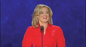
Fig. 2: An example of a background being very saturated and low in brightness I would venture to say that, no matter how cleverly the screens are placed and configured, their appearance results in a certain degree of sameness. The phrase “wow factor” is quite prevalent at production meetings in which the use of such devices is discussed. In truth, the video displays register merely a blip on the wow meter. Using the displays, it is extremely difficult to achieve any feeling of dimensionality and space; everything appears quite cramped, sparse and in the same plane.
A MORE SERIOUS PROBLEM
Many times, I have emphasized that the basic, most important television viewpoint is the chest shot of a single person. It is the image of choice when we wish to direct the viewer to listen to the words of the speaker, whether the entertainment is a political convention, a talk show, an episodic or a concert.
This tight shot is the moment when every detail and image element—lighting, audio, costume, makeup—should be as perfect as possible so as to enhance, not distract. Any compromise of the significant elements of this image will decrease the importance of this shot. Wide, impressive panoramic shots, which illustrate the scope of the event and define the real estate, are reserved for pauses made for applause and audience reaction. Fig. 2 illustrates this point.


Fig. 3: The left photo fails the monochrome test. After removing the color, the photo on the right
(Fig. 4) illustrates the extreme saturation of the color and the reduced importance of the speaker. First of all, it is typical of the dull and unimaginative shots that result when the background is just the video screen with little or no information/detail in the shot. In this case, the background is one color, and what a color! Blue, of course, is always considered a safe color as it can approximate the complement of the flesh tone of the subject. However, this particular color is not too handsome, being very saturated and low in brightness as well. To me, it looks like the color was chosen in order that the shot be suitable for compositing, keying in a background. The overall effect can only be described as dismal.
FOLLOW THE YELLOW BRICK ROAD
Another example is Fig. 3. The left photo fails the (my) monochrome test. If we remove the color, we are now able to clearly see the brightness range of the image (Fig. 4).
Fig. 4 dramatically illustrates that we have reduced the importance of the speaker in the foreground, not only with extreme saturation of the color (as displayed in Fig. 3), but also with brightness that is greater than the subject’s face value. For this transgression, this image barely gets a passing grade. We can only guess that there was limited communication between lighting, projection and production departments (as well as running out of color selections).
I do apologize for being so tough on the group of professionals who are responsible for creating the imagery of these television events. But we should expect an exemplary result from them. It’s not about rule-breaking, but we do expect to be “wowed” by superior image quality (and not 4–12 streaks smeared across our pictures).
Let’s put the star filter away for a lot longer than four years and concentrate on directing our resources to providing pleasing, flattering backgrounds that display dimensionality.
Bill Klages would like to extend an invitation to all the lighting people out there to give him your thoughts atbillklages@roadrunner.com.
